Healthcare websites and member portals are unfailingly complex. With everything from provider listings and plan details to claims information and personal health records, each site visitor must wade through a wealth of information to find what they’re looking for. UX design is all about simplifying that experience — and search plays a critical role in making that happen.
When you think about it, search has an almost magical ability to enhance (or disrupt) your healthcare digital experience. Done well, search puts users in the driver’s seat. It allows them to instantly zero in on the information they need to cross their next healthcare task off their list. Done poorly, and search can be your digital experience’s downfall. With subpar search components, users are much more likely to experience frustration, assume you don’t offer the products or services they are looking for, or abandon your website altogether.
Search is deceptively simple: just type in a query and fetch the results. Yet the under-the-hood mechanics of a truly great search experience are anything but. If you want to serve up a high-ranking user experience — and keep up with healthcare consumers’ ever-increasing digital expectations — you can’t afford to skimp on search. Here’s what to consider as you get started.
How to Design a Powerful On-Site Search Functionality To Enhance Your Healthcare Digital Experience
Like all good functional design, search is mostly invisible. From the users’ perspective, it’s the results that count. But that doesn’t mean all search functionalities are one and the same. There are many different ways to approach search. So before installing the nearest plugin, take a few minutes to consider your options, including:
- Query types
- Search form and logic
- Search results
Query Types
The foundation of any good search experience is the system’s ability to understand a user’s query and serve up relevant results. Your on-site search module should be capable of handling several common query types in order to provide the best possible user experience. These include exact search, symptom search, and natural language search.
- Exact search. Your users are most likely to pose an exact search query when they know precisely what they’re looking for within your system. For example, they might search for a specific doctor’s name or the name of a practice, medication, specialty, or procedure. As you might expect, exact search queries are the easiest to implement and support technically. However, if a user misspells an exact search or adds another keyword to the query, your search functionality should still be able to offer useful suggestions. For example, your system might serve up alternate query suggestions (“Did you mean…?”) or related search results (“Including results for…”). These helpful prompts should appear at the top of the results page after users type in their initial queries.
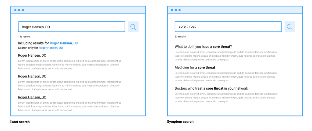
- Symptom search. When users search for a solution by describing their problem, that’s called symptom search. Because users don’t know what they don’t know, this type of search query can help users gain a new awareness of the services available to them. For example, if a member searches for “sore throat” or “dizziness,” your search functionality might serve results pointing to a primary care physician or urgent care clinic. One common pitfall? Systems that aren’t able to recognize common synonyms. For example, if a search for “faintness” turns up only 10 results while a search for “dizziness” yields 75, you have a problem. By reviewing your search logs regularly, you can identify synonyms your members are using that don’t match your own content. You can use this information to create a synonym table in your search engine, increasing the accessibility and reliability of your search offerings.
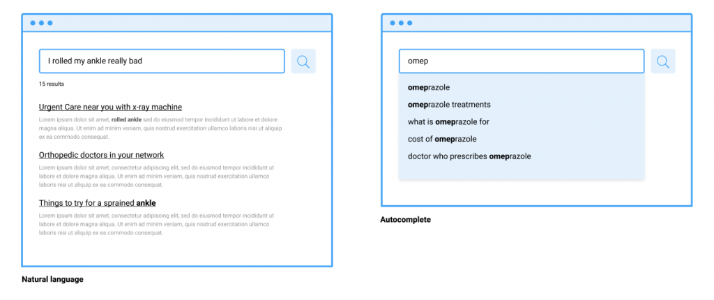
- Natural language search. Natural language search — or queries that are phrased as if a user is describing their question to a friend — is one of the more technical aspects of search to implement. But the payoffs of investing in this “gold standard” of search queries are great. In the healthcare space, there is almost always a knowledge gap between patients and providers or payers. That gap can be both frustrating and intimidating for patients and their families. By allowing users to type in queries like “where to find a doctor for my four-year-old who doesn’t speak well” and returning truly helpful results, you can effectively reduce that gap while also helping your members get the care they need.
Search Form and Logic
While the underlying search engine you use forms the “backbone” of your search functionality, you can deeply impact your healthcare UX by tweaking the design and function of your search experience. There are myriad ways to enhance the form and logic of your search component. Consider incorporating the following to level up your search and make it easier for your customers to find what they’re looking for.
- Autocomplete. Autocomplete offers suggested search queries to “complete” users’ thoughts as they type in search terms. This tool helps users to identify common search terms and avoid typos. It also subtly trains them to think in ways that match the scope and mental models of your site’s search functionality. Something to watch out for: Users often compare on-site search functionalities to Google and other major search engines. If your on-site search function doesn’t suggest queries as effectively as, say, Google, the result can sometimes be search or even site abandonment.
- Search suggestions. Search suggestions, which are usually shown in the drop-down menu below the search bar while the user is typing their query, are another way to aid users in their search. Suggested searches show users what is available on your site, how to spell complex words, and what other users are searching for. The suggestions should change as users type each letter, which allows them to pick the most relevant query with the least amount of mental effort. To add even more value, consider curating and organizing suggested searches by content types. For example, if a user searches for “thyroid,” search suggestions include a quick link to benefits and coverages, a short list of top providers, and common or prescribed medications related to thyroid issues.
- Scoped search. Scoped search allows users to manually limit their search to a specific type of content on your website. For example, they might limit their search to doctors, facilities, drugs, or even to practices that fall within their network. This allows users to find what they’re looking for faster as results are automatically narrowed to suit their needs on the front end. A word of caution with this approach: Users often overlook manual scope selectors, misunderstand how to use them, or forget about them after they are applied. Evaluate your site and search logs to determine if users are really benefiting from this approach. And make sure the default is always set to search the entire site.
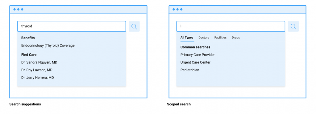
- Search bar placement and design. It may seem obvious, but the design, size, and placement of your search bar all impact the usability of your search functionality. The larger and more upfront the search bar is, the more people will use it. Once you’ve optimized your search functionality, make sure you emphasize it within your digital experience. If, on the other hand, it’s severely lacking, you may want to visually deemphasize your search bar until you can provide a better experience.
Search Results
The way your system delivers search results is almost as important as its ability to fetch those results in the first place. Consider the following tips and options:
- Display original search queries. Make sure to display a user’s original search query on the results page. This prevents them from typing the same query over again if they don’t get the results they’re looking for. This is an easy technical lift that, when not done, can really frustrate users.
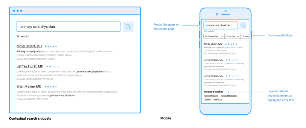
- Display the number of results on a page. While it might seem straightforward, many sites fail to clearly display the number of results shown on a given results page. Researchers have found that users rely on the number of results on a page to judge the success of their query. This helps them decide if they want to adjust their language, apply filters, or start sifting through the results. This is relatively easy to implement, making it a low-cost improvement that can give your users a greater sense of control in their search experience.
- Leverage alternate queries and paths. Consider presenting alternate queries or paths on the results page to provide users a different route to explore if they don’t immediately see the results they’re looking for. Similar to search suggestions or autocomplete, this gives users a better understanding of what else is available on your site. Doing so helps prevent search abandonment, thus preventing a subsequent rise in customer care calls.
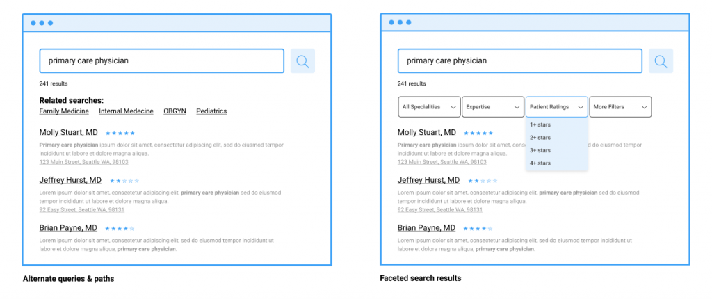
- Consider faceted search results. In many cases, users abandon search sessions because they get too many results. If they don’t find the right results on the first page, users may get overwhelmed and abandon ship. Faceted search offers an answer to that very real problem. It gives users the ability to filter results after they are returned by the system. The majority of e-commerce sites already employ faceted search. Many users expect the same search capability in their healthcare digital experience as well.
- Utilize contextual search snippets. Contextual search snippets offer a short summary of each search result and help users understand why and how it was matched to their query. This is a common pattern on all major search engines, one that allows users to quickly scan results without having to click each one individually to assess relevance. The information presented could also be adapted based on the category within which the user is searching. For example, if a user searches for “primary care physicians in my network,” the snippet could include the physician rating, contact info, and address. Visuals such as maps could also be employed to help users compare distances from their location.
- Don’t forget mobile users. Search is often the preferred navigation method on mobile, so it’s extra important that you get your search functionality right in this context. Mobile offers a number of unique challenges, including reduced screen real estate and a more error-prone keyboard. All of the same recommendations apply. However, features like autocomplete and alternate queries on the results page go a long way to ensuring users can seamlessly navigate your site’s content on their mobile devices.
Customize Your Search Functionality to Meet Your Users’ (and Business’s) Needs
Search is a critical component of your healthcare organization’s digital experience. It has the power to simplify your users’ experience, increase your organization’s credibility, and take pressure off your customer service center, too.
At the end of the day, though, the on-site search functionality you design should flow from the needs of your organization as well as the user groups you serve. By conducting user research, reviewing search logs, and mapping those insights to your business goals, you can make smart decisions about which features to implement and prioritize.
Wherever you land with it, by prioritizing search you can help your members access care faster with less friction — and provide a superior user experience in the process.